

How To Use Betfair Charts & Improve Your Trading

Understanding and being able to effectively use Betfair charts and graphs is one of the key factors that make a successful Betfair trader.
In this guide, we will be going over the basics, from how to access the Betfair charts, to what they mean and how to read them. Hopefully, after reading this article you will be able to improve your trading substantially.
Once you begin to read the charts effectively, you will start to notice patterns that pop-up frequently. You can use these patterns to your advantage when trading to make quick and consistent profits.
Where To Find The Charts
If you are a complete beginner, you may not even know about Betfair charts and graphs, or where you can find them.
They are free analytical tools that anyone can use to observe how prices have changed over time with volume of bets matched (note that bets only show up in the charts when they have actually been matched).
To find the charts themselves, simply select any event you wish to view the data for. Then click on the charts icon next to one of the event outcomes. This will open up the charts tab in a separate window. Make sure you allow pop-ups so the window can open.
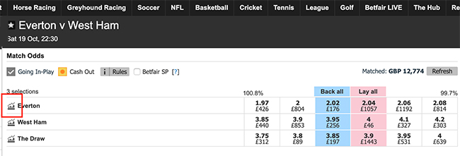
This information is presented for each outcome for the event. In this case, an Everton win, a West Ham win, or The Draw. You should be presented with a window with both a graph and a table.
What Do The Charts Mean?
Open up the window for your chosen event and we will go over the various important components and explain what you are looking at.
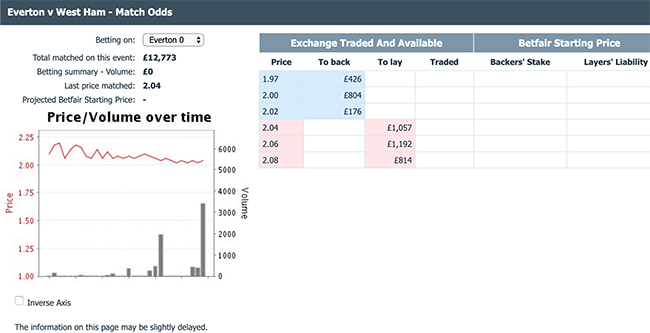
The table on the right shows current prices and total amounts available for each price, for both backing and laying. This data is all for betting on Everton, but you can change which outcome you are viewing with the drop-down menu.
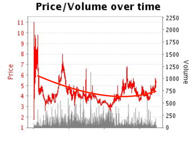
The graph shows Price/Volume over time, with Price on the left y-axis and shown by the red plotted line, and Volume on the right y-axis, shown by the grey bars.
Price
Price is plotted as a red line on a Betfair chart. Prices are displayed in decimal format. Put simply, this is just a plot of how the price of odds have changed over time. In this example, we can see that odds started at around 2.13, and have dropped slightly to around 2.04.
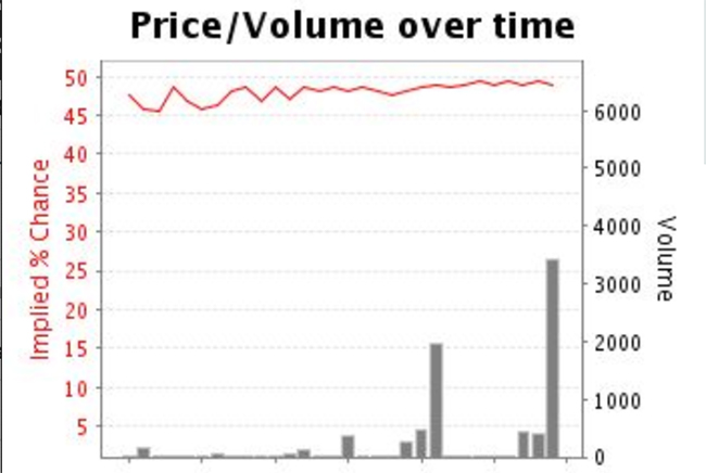
We have the option to invert the y-axis for price, which will instead give us ‘Implied % Chance’, between 0-100%.
Volume
The grey bars at the bottom of the graph show bet volume (size) over time. Again, this is just for bets that have actually been matched on the Exchange. For this example, we can see that the biggest matched bet so far was for around £3500, and was placed quite recently.
There are also a few details above the chart, such as the total amount of money that has been matched so far for this event, as well as the most recent odds for which a bet was matched.
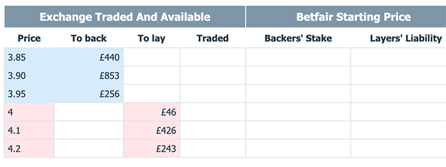
Exchange-Traded And Available
The table to the right of the graph shows you how much money there is available to stake at various odds.
In this example, we can see that if we wanted to back West Ham to win at odds of 3.95, there is currently only £256 available. If we wanted to stake higher than this, we would have to take the lower price of 3.90, where there is £853 available to be matched.
It is important to note that the charts are not live. The information displayed is usually delayed by at least 10 minutes. Therefore, the charts shouldn’t always be relied on for immediate data.
How To Read The Charts
Now that you know the basic components of the charts, we can start to look at various techniques for analysing the charts, and how we can use this information to improve our trading/betting.
Please remember that although we can pick out definite patterns in historical data, the charts still only shows us information from the past. You can never rely 100% on past data to predict the future, as at some point you are bound to get caught out.
There are plenty of other factors that you should also look at when considering your trades. As with any of these factors, no one factor alone should be used to, and instead, you should always use a combination of techniques to help you place your bets.
The simplest way to use these charts would be to look for an overall trend in the price of specific odds. If you can see that odds are moving in a certain direction, it would make sense to predict that it would continue to move in that direction.
This is the most basic analysis and tends to fail fairly frequently. As you can see in our previous example, the odds for Everton started off rising, but the trend overall was to fall from the initial price.
We can start to see data as quickly as just 10 minutes after a market opens. However, this does not mean we should immediately look at the trending direction and assume this will be the only direction that the odds will move.
Betting on an event early is a high-risk move. Unless it is a huge event where many people are placing big wagers, there usually will be very low liquidity early on. Therefore it is usually a safe move to wait it out a little for the market to become more liquid.
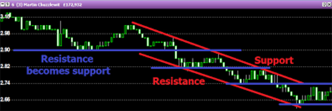
Easy things to look out for are support and resistance points. These are price points at which the price movement tends to vary between. It is usually the crossover between backers and layers, where both can see value.
An example would be a horse with odds of 5.2. The odds for this horse might fluctuate between 5.0 and 5.4 as backers and layers jockey between one another. If a backer places a bet at 5.2, the price might fall to 5.0. At this price, a layer may see value, causing the price to rise back up to 5.2, and vice versa.
There is a trading opportunity here for scalping the market. If you can see a clear fluctuation between two distinct price points, you can choose to buy at the lower price and sell at a higher price, making yourself a quick profit.
You can practice this technique for free, simply by watching the charts as they fluctuate before and even during a race. Most markets will pick up about 15 minutes before a race kicks off as bookmakers start laying off their positions.
Try and identify support and resistance points, and see if you can see the trading corridor for each horse in the race.
The placing of larger wagers (larger than the average fluctuating wagers) will cause the price to shift dramatically. After this happens, a new equilibrium will be found as traders adjust to the new price point. There is an opportunity here if we can predict which way the breakout will move.
In horse racing, it is also possible to identify what we would call false favourites. This is simply a horse that is touted as the favourite but may only be so due to an artefact of the market.
To do this, we must look at the total amount bet and compare this to the amount bet on the favourite. Then compare that to the price of the favourite. Does the price make sense?
A false favourite will be weak in the market, or may simply be the best of a bad bunch. In a field full of inexperienced horses, picking a true favourite is pretty difficult.
We can take advantage of this in a few ways. We can lay them early on, and then wait to see if they drift. Or we can lay them and look to back them later on in the running if prices improve.
Things to Remember
In the right hands, Betfair charts can be a powerful trading tool. It is important to not get bogged down looking at one chart. Comparing multiple charts for different events is advantageous in finding patterns.
Next time you’re on the exchange, have a look at the previous charts for a horse before betting on them. See if there are any patterns in trading that particular horse that you can recognise in the current chart and therefore take advantage of.
As always, make sure you aren’t basing all your decisions on just one chart, or one piece of data. Try and look at the big picture as often as possible.
About the Author
This post was written by Andy Beggs. Andy is a keen sports fan and has been writing for Beating Betting from his home in Australia since August 2019.